Client: EXSTEP
Service:
Visual Brand Identity Design
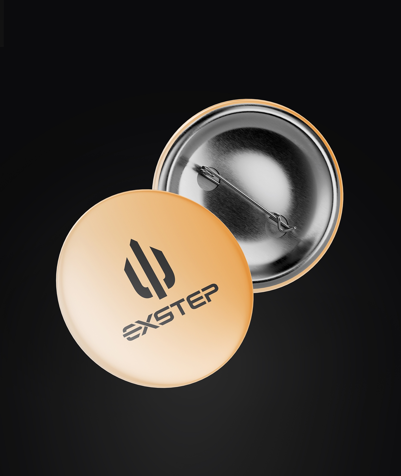
About the Company: Logo design for EXSTEP, a manufacturer of equipment for work in extreme conditions. Every design choice was driven by the specific demands of an industry where equipment must function flawlessly at the edge of human capability.
Inspired by this
project?
Contact us — we’ll create a creative solution for your brand.

Go to next project
Inspired by this
project?
Approach:
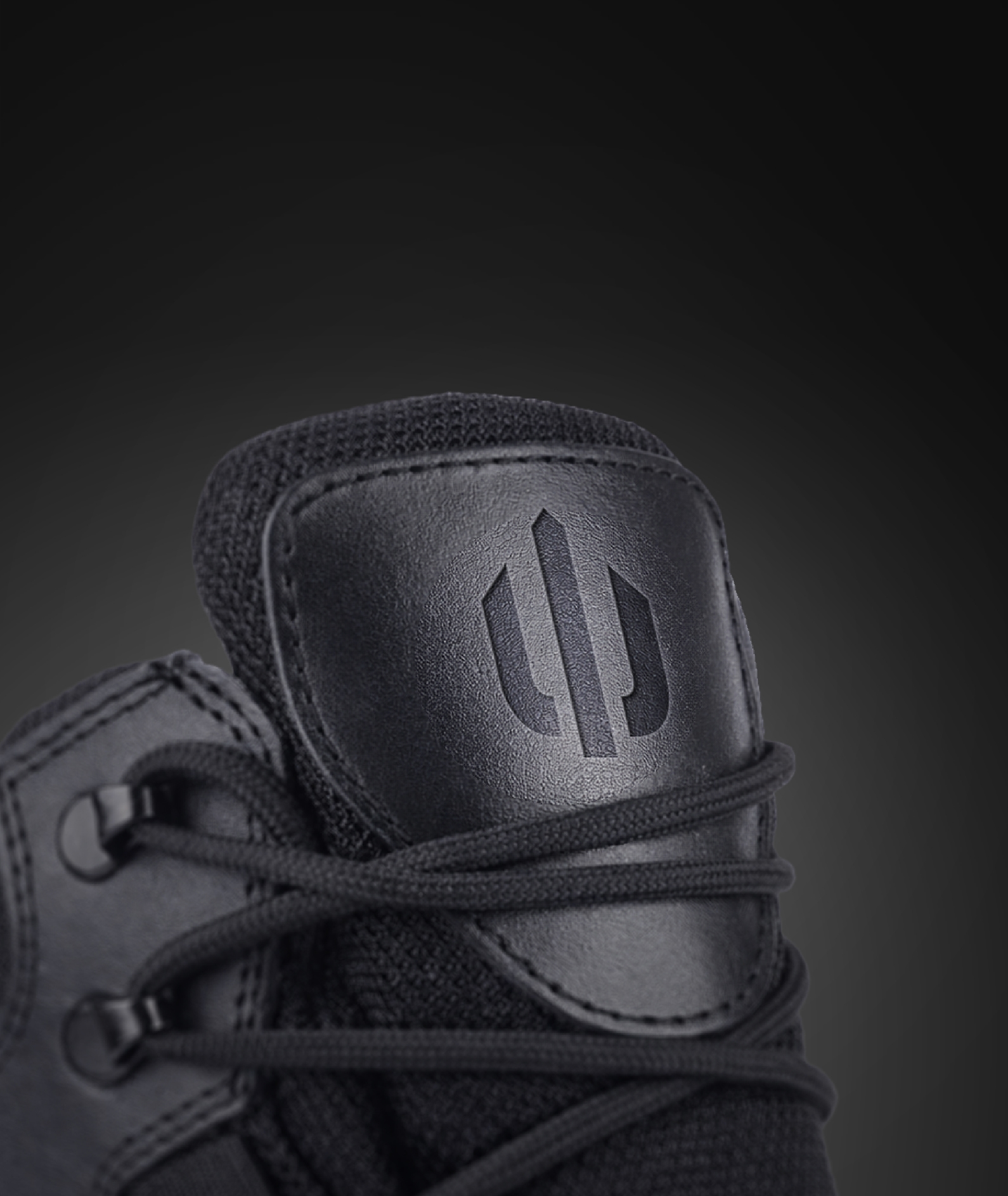
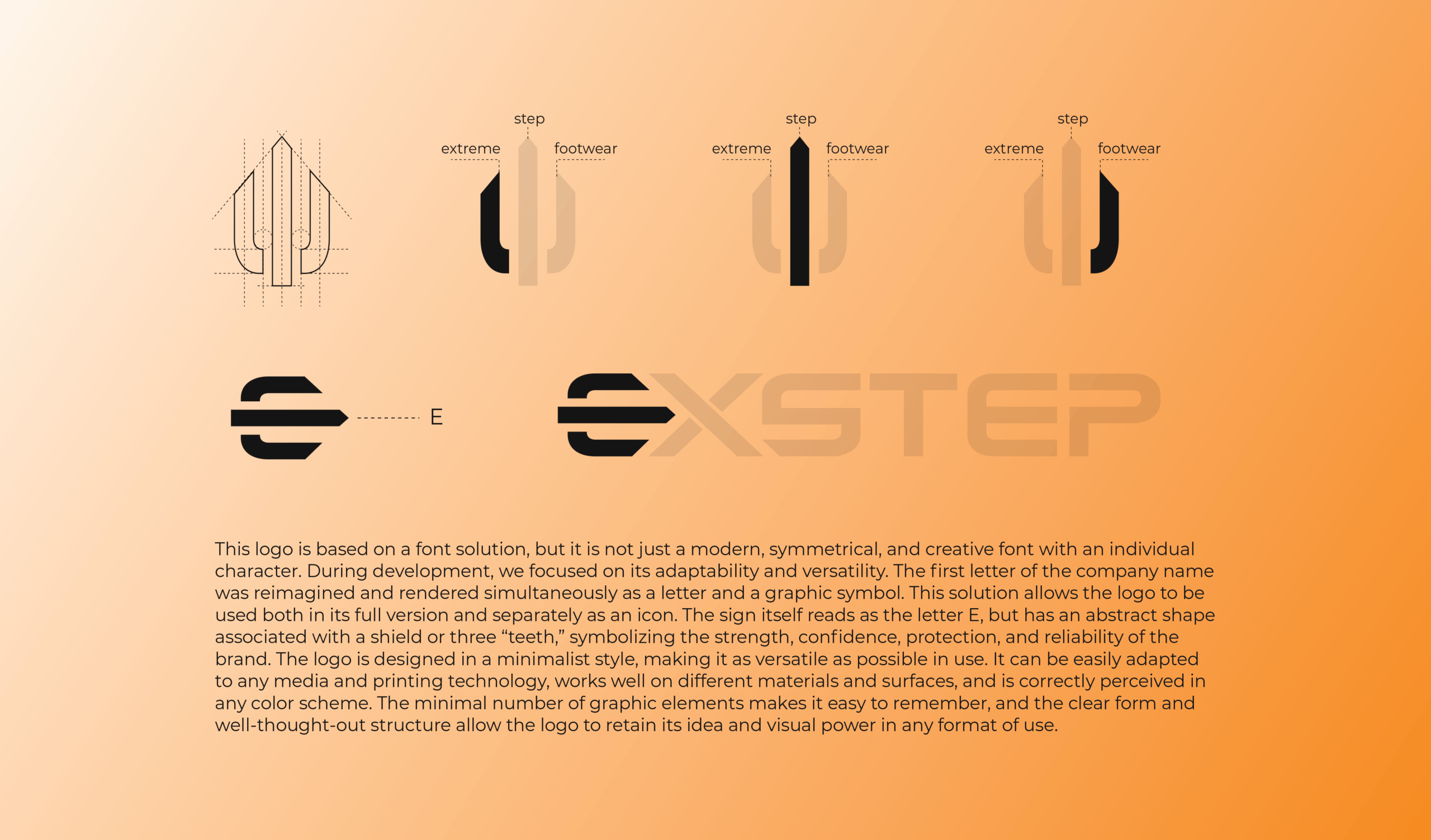
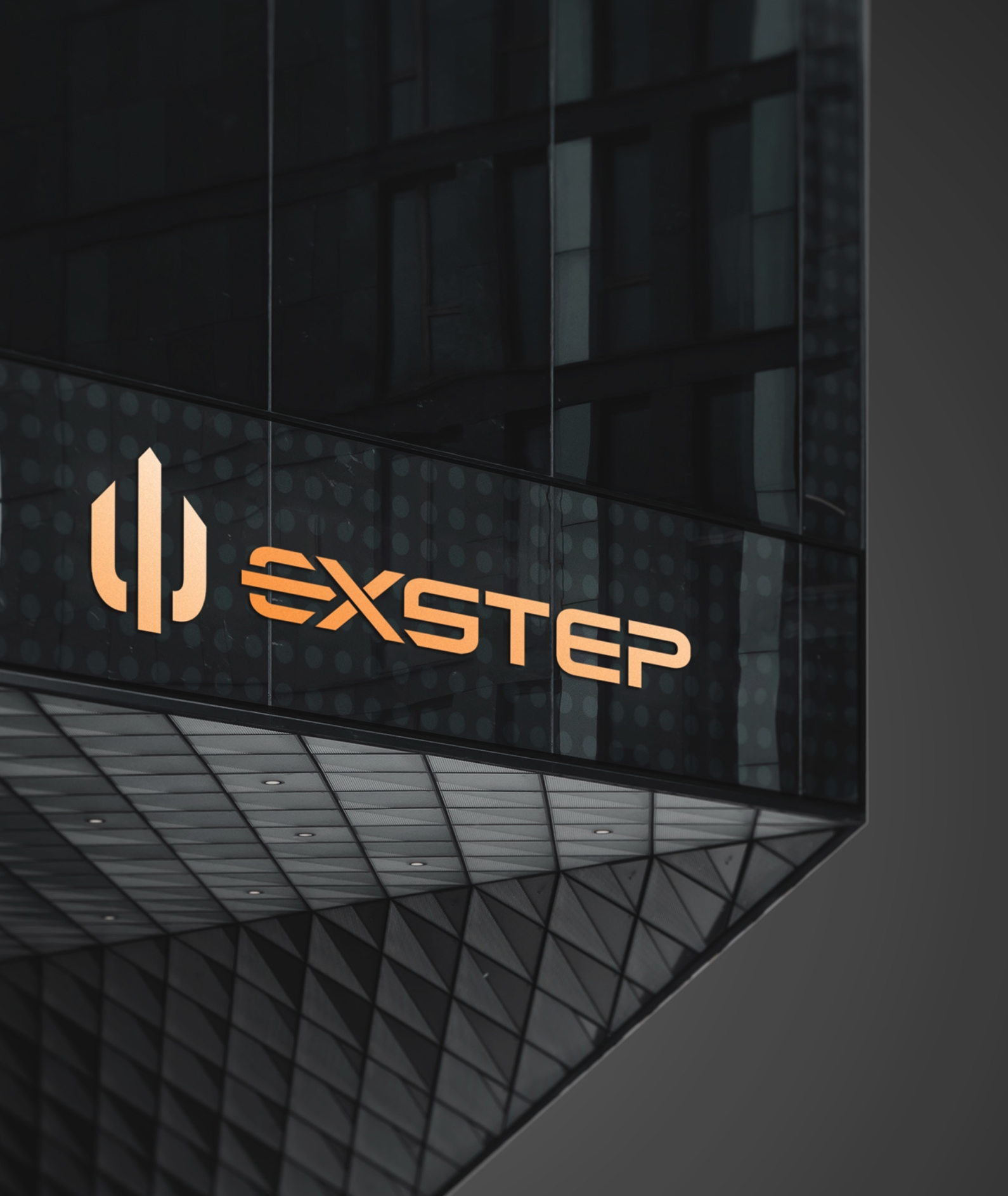
The logo is built on a custom typographic foundation with a strong focus on versatility. The first letter of the brand name is reinterpreted as both a letterform and a standalone graphic mark, allowing flexible use as a full logo or as an icon. This strategic approach ensures perfect legibility across all mediums — from miniature garment patches to large-scale industrial marking.
The symbol reads as the letter E while referencing a shield-like form, representing strength, reliability, and protection. The use of bold, heavy linework creates an unmistakable sense of stability and confidence, essential qualities for professionals operating in high-risk environments.
Project Team:
Designer:
Kateryna Ilchenko
Designer:
Roman Pavlov
Art Director:
Anatolii Sydorenko
Inspired by this
project?

THANKS FOR
CHOOSING US.
WE WILL CONTACT
YOU SOON!